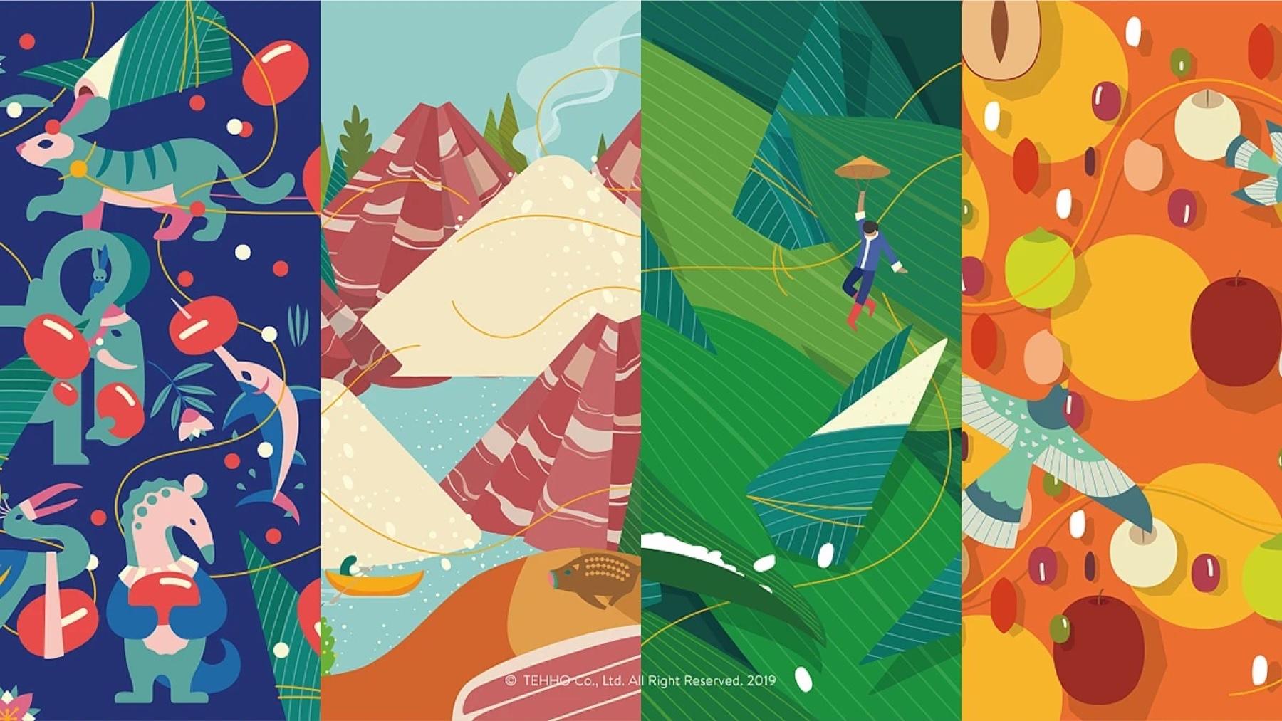
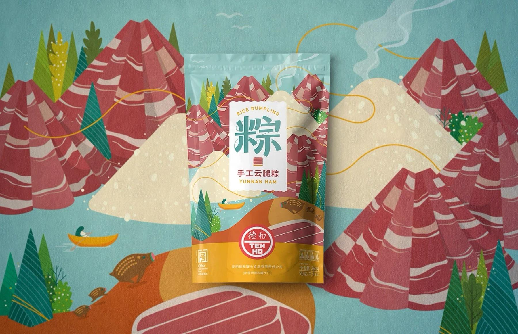
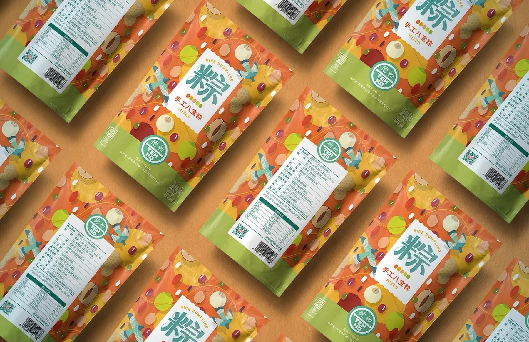
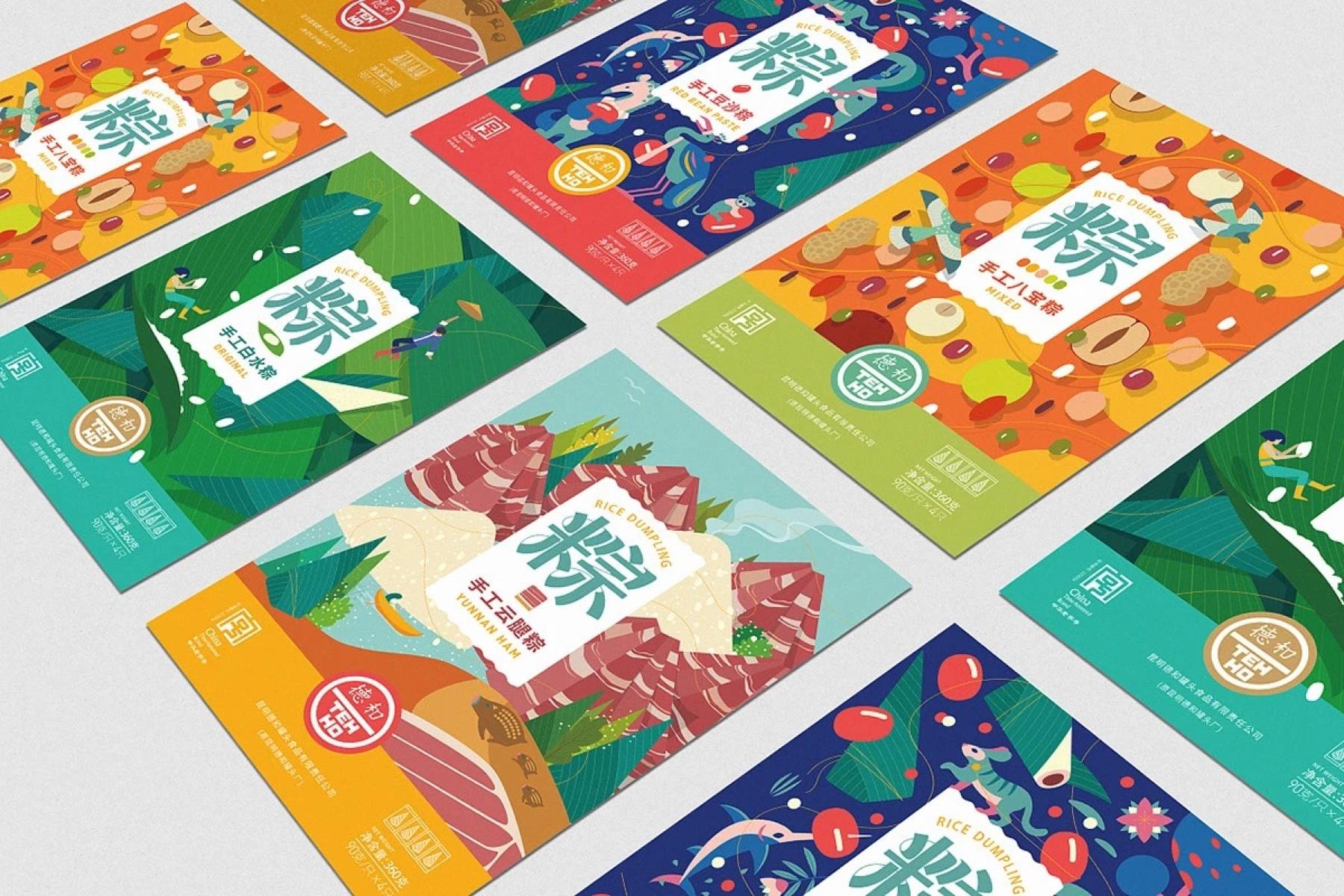
DEHE is a heritage food brand that needed a refresh for younger shoppers, and a zongzi range that is easier to recognize on the shelf.
BRAND IDENTITY · FESTIVAL PACKAGING
DEHE Dragon Boat Festival
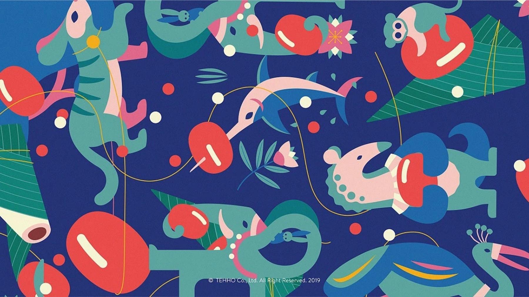
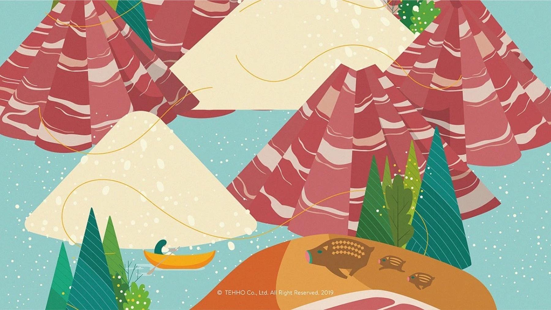
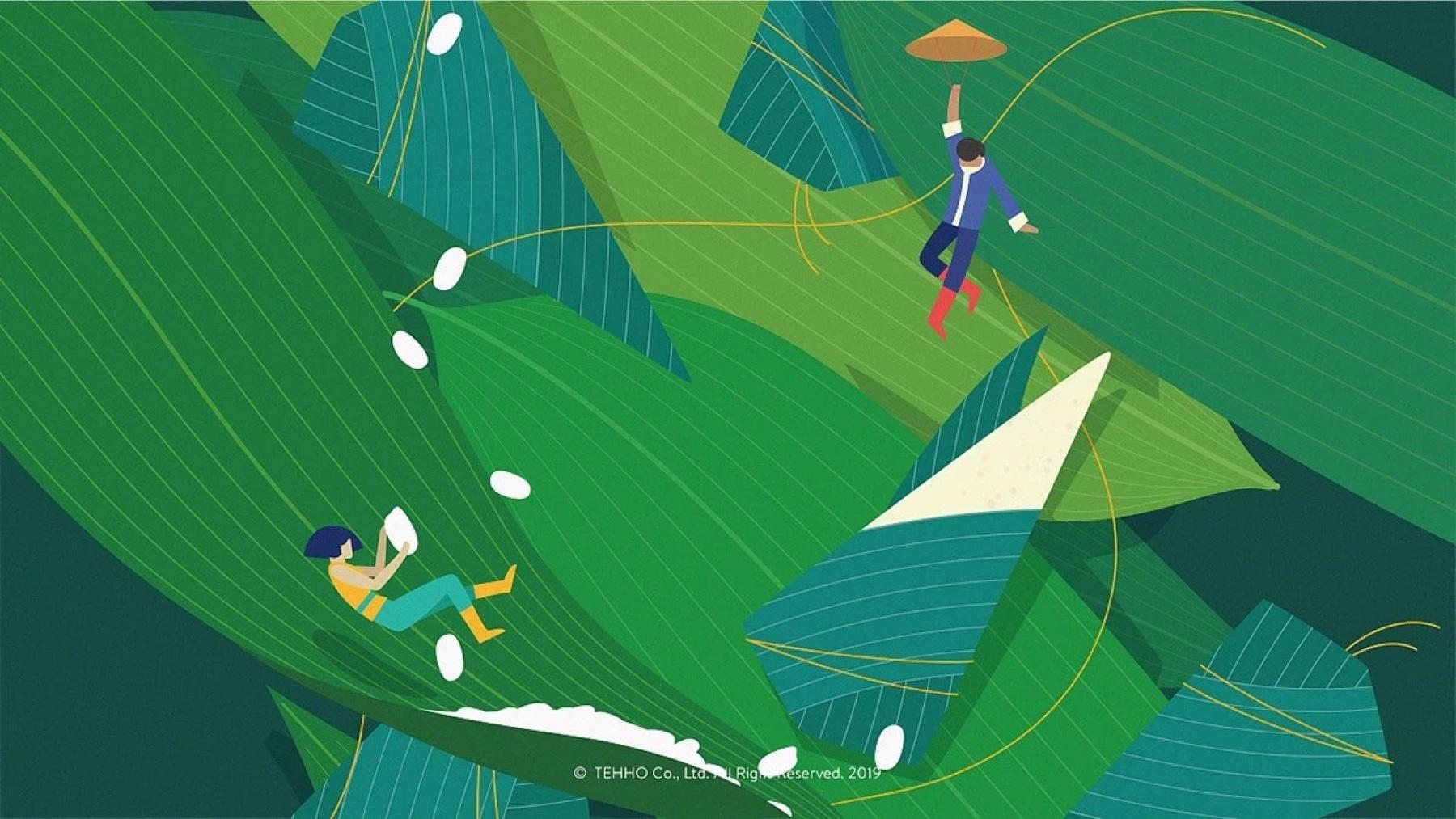
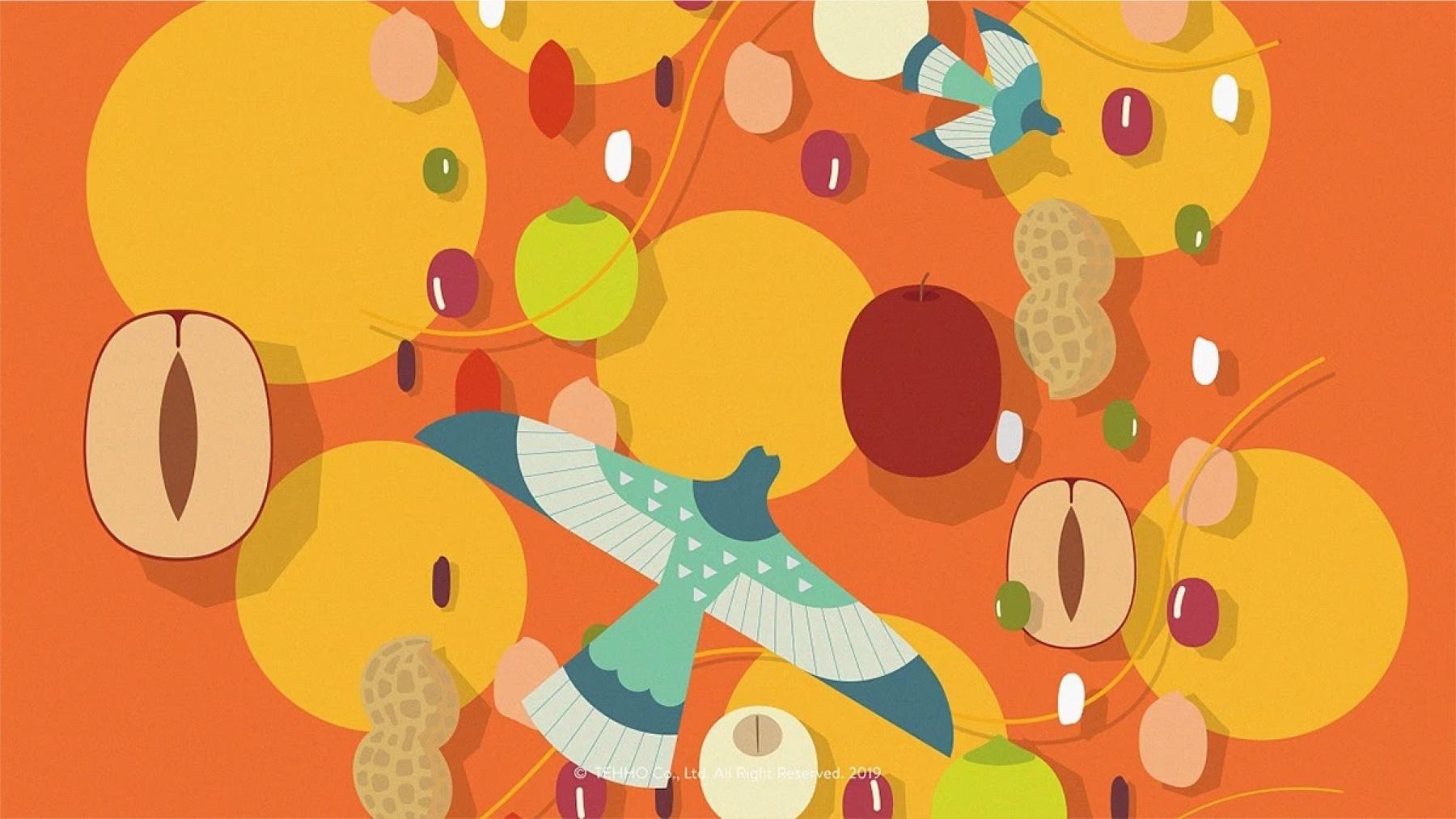
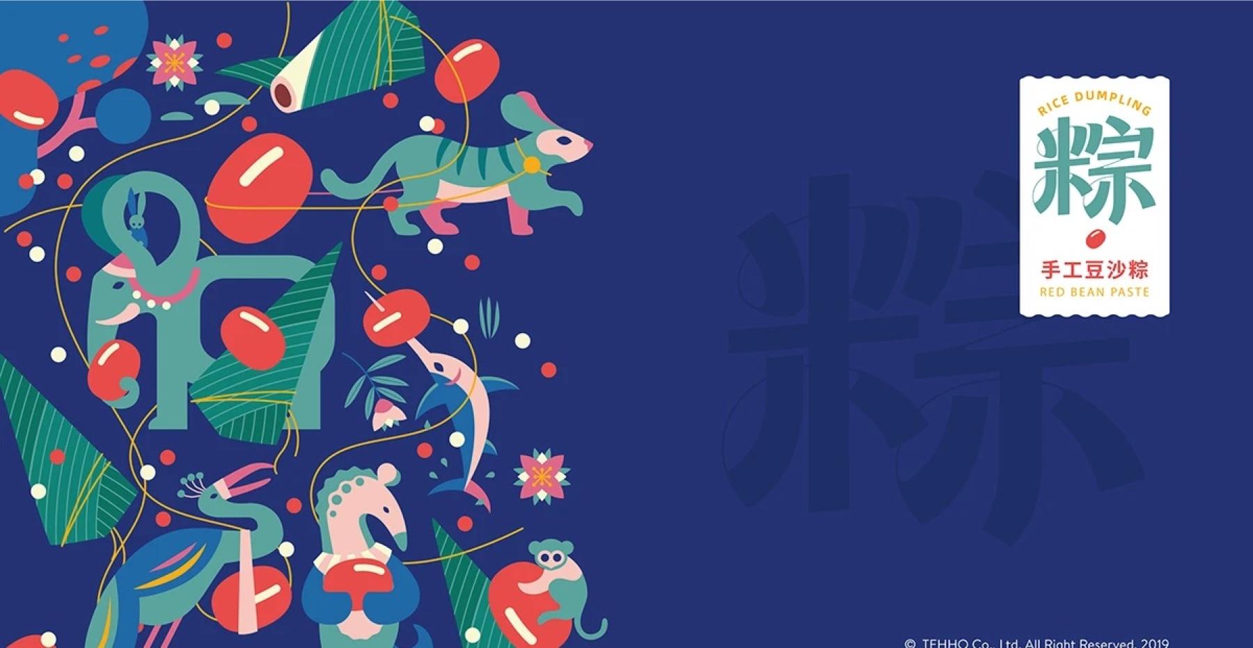
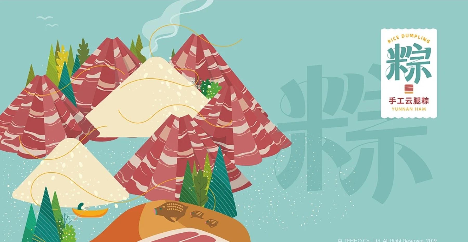
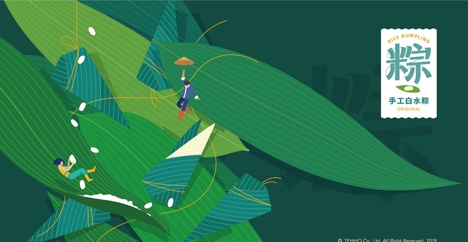
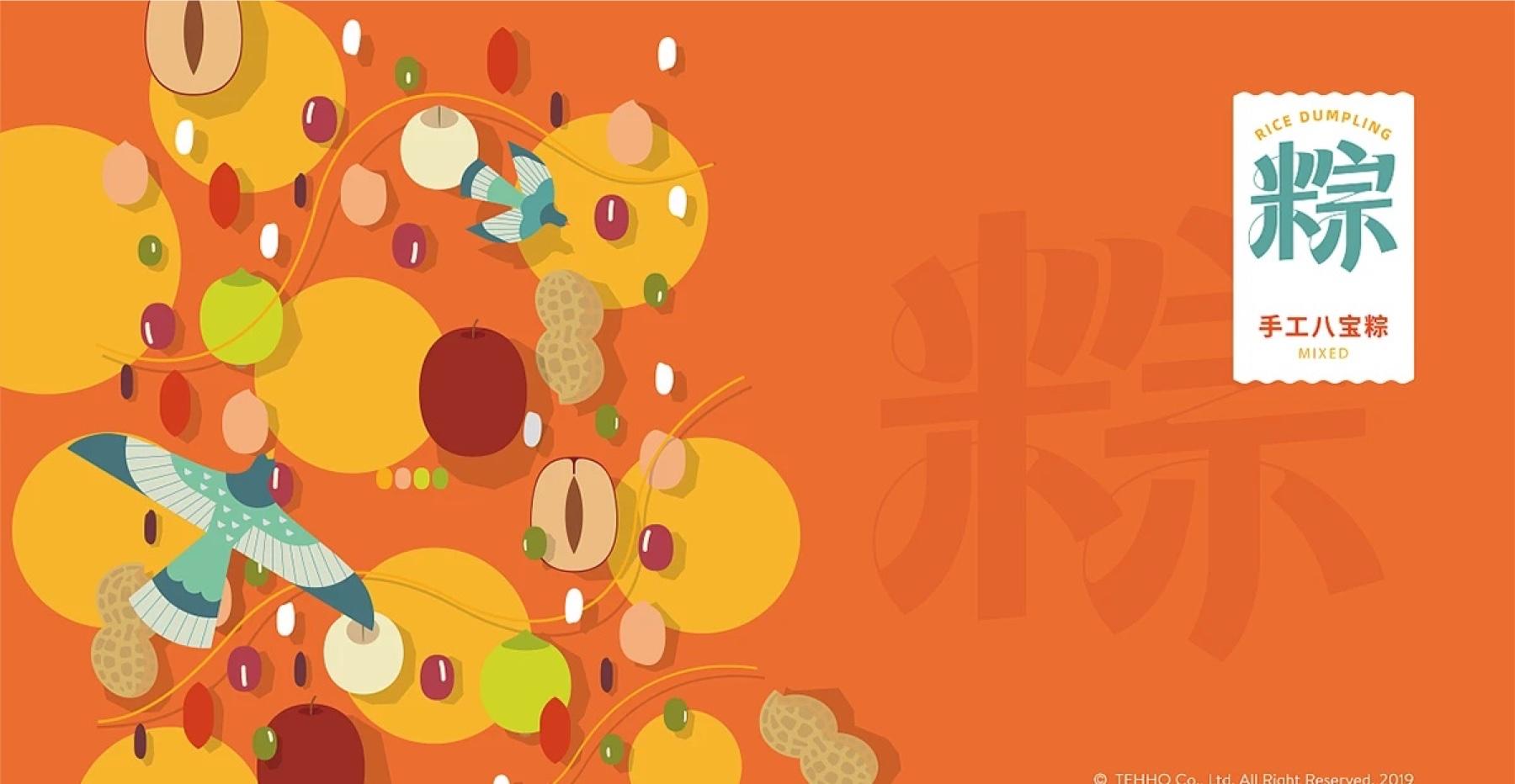
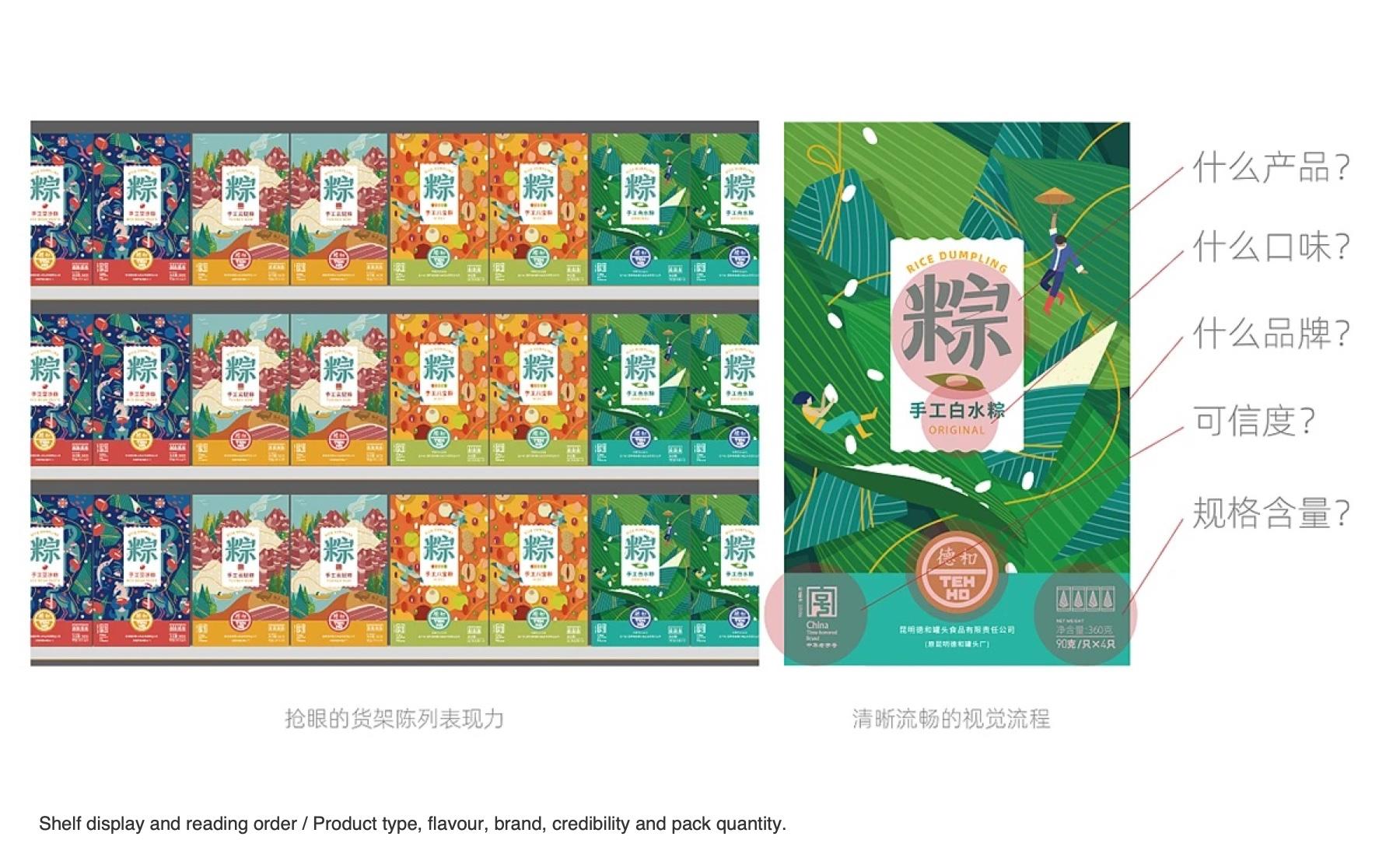
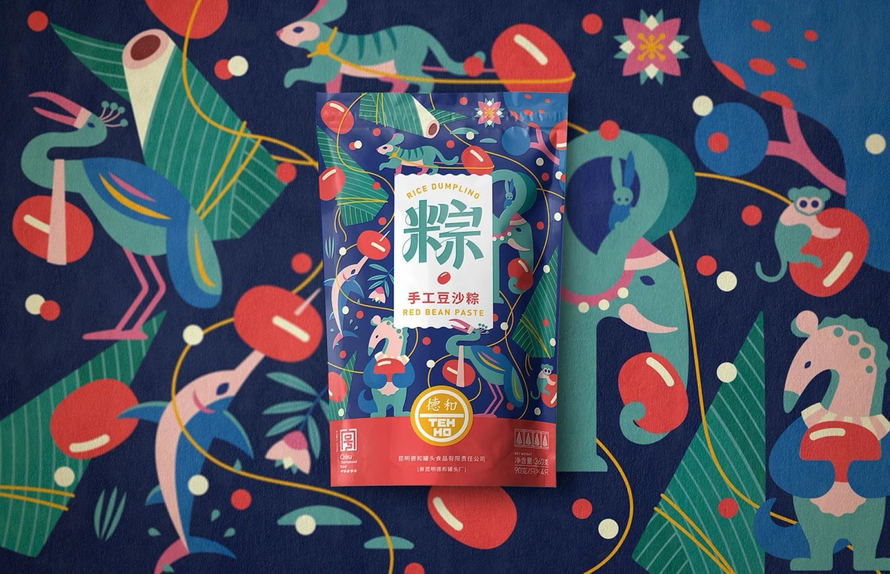
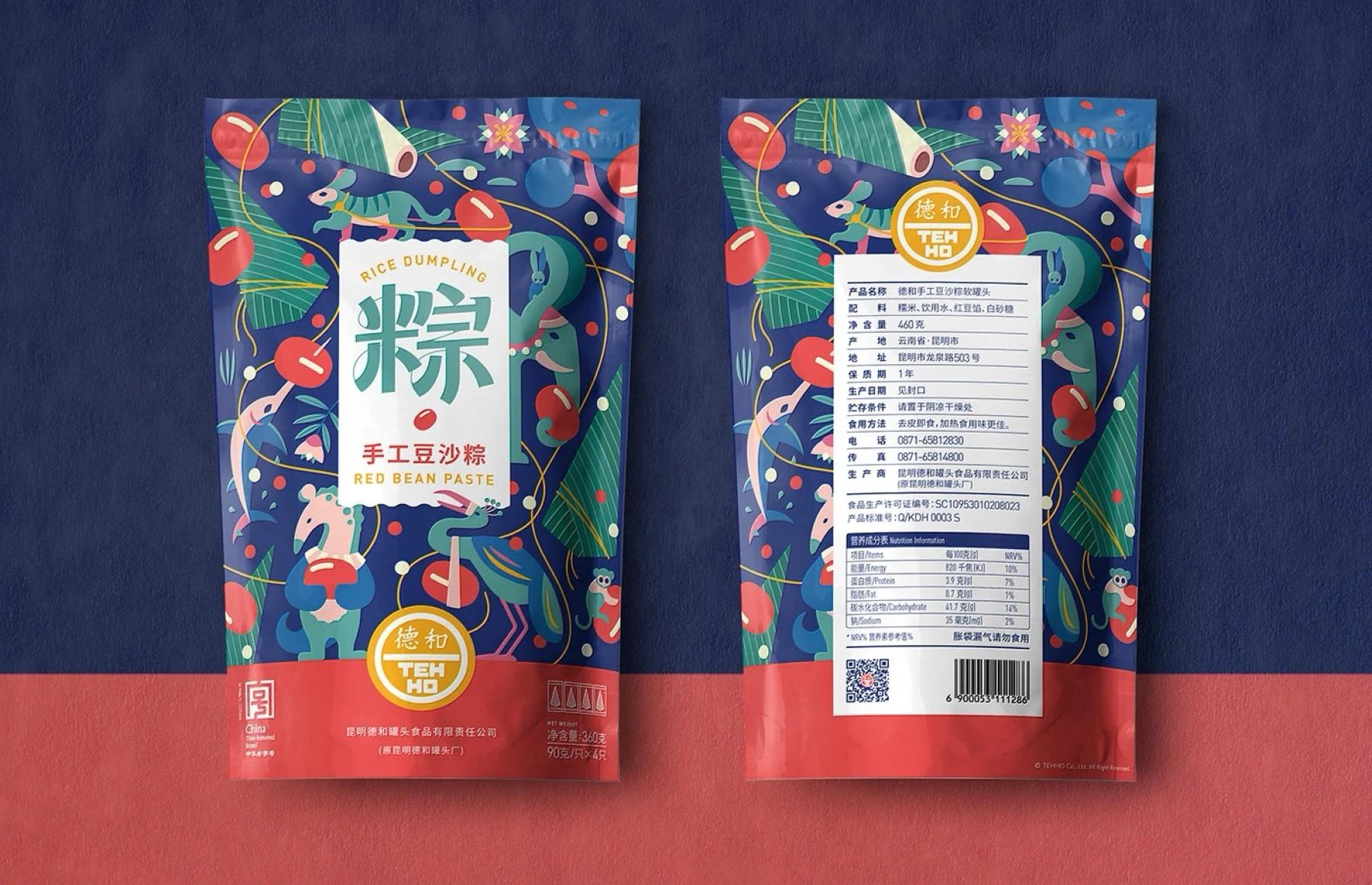
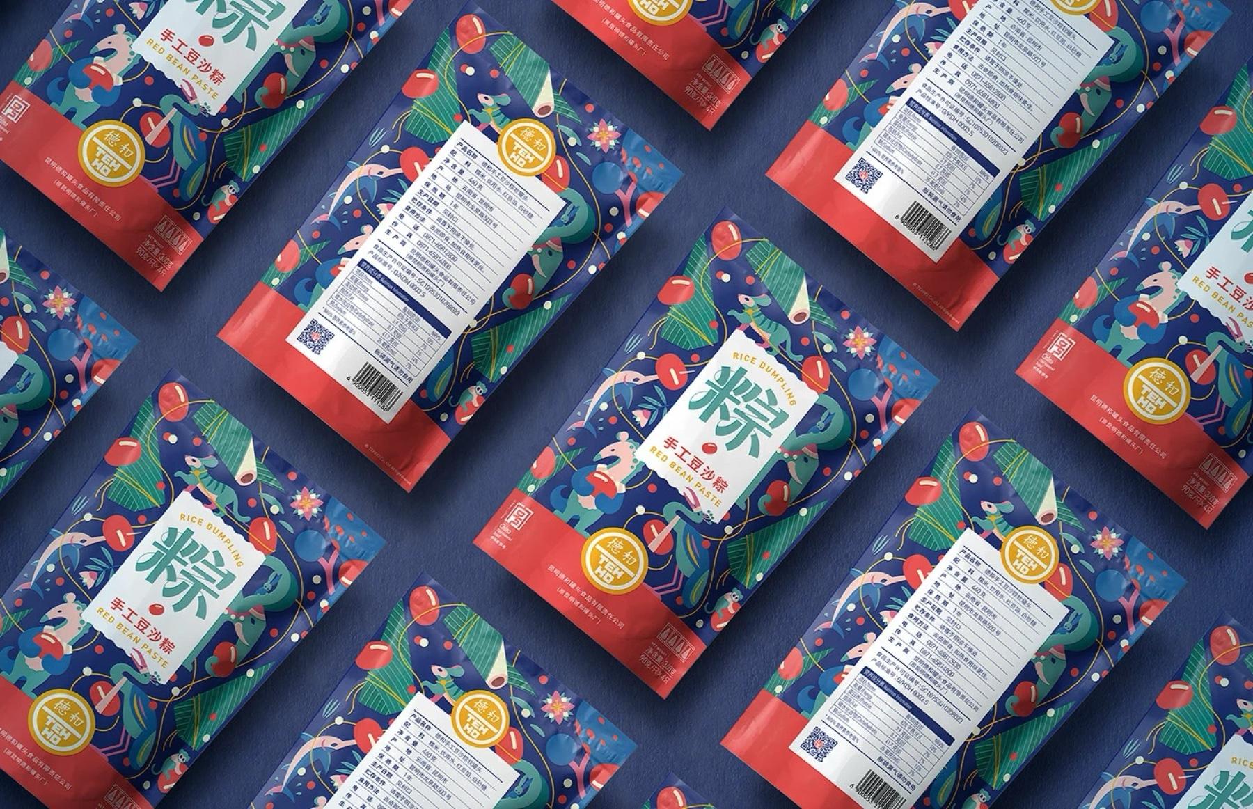
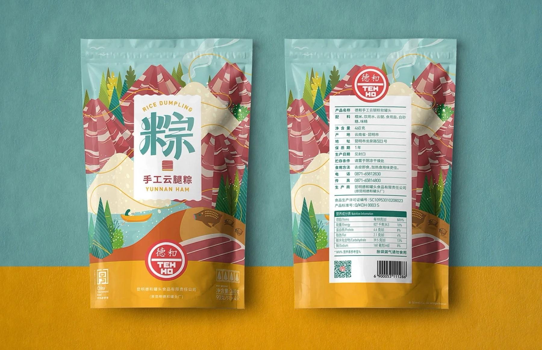
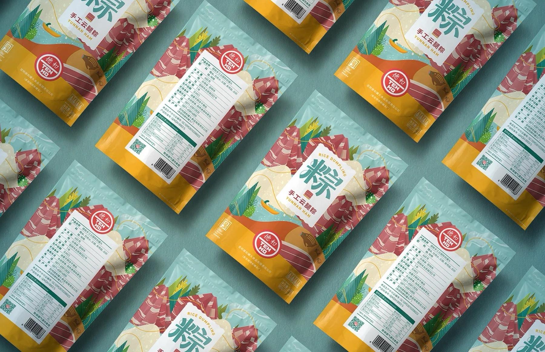
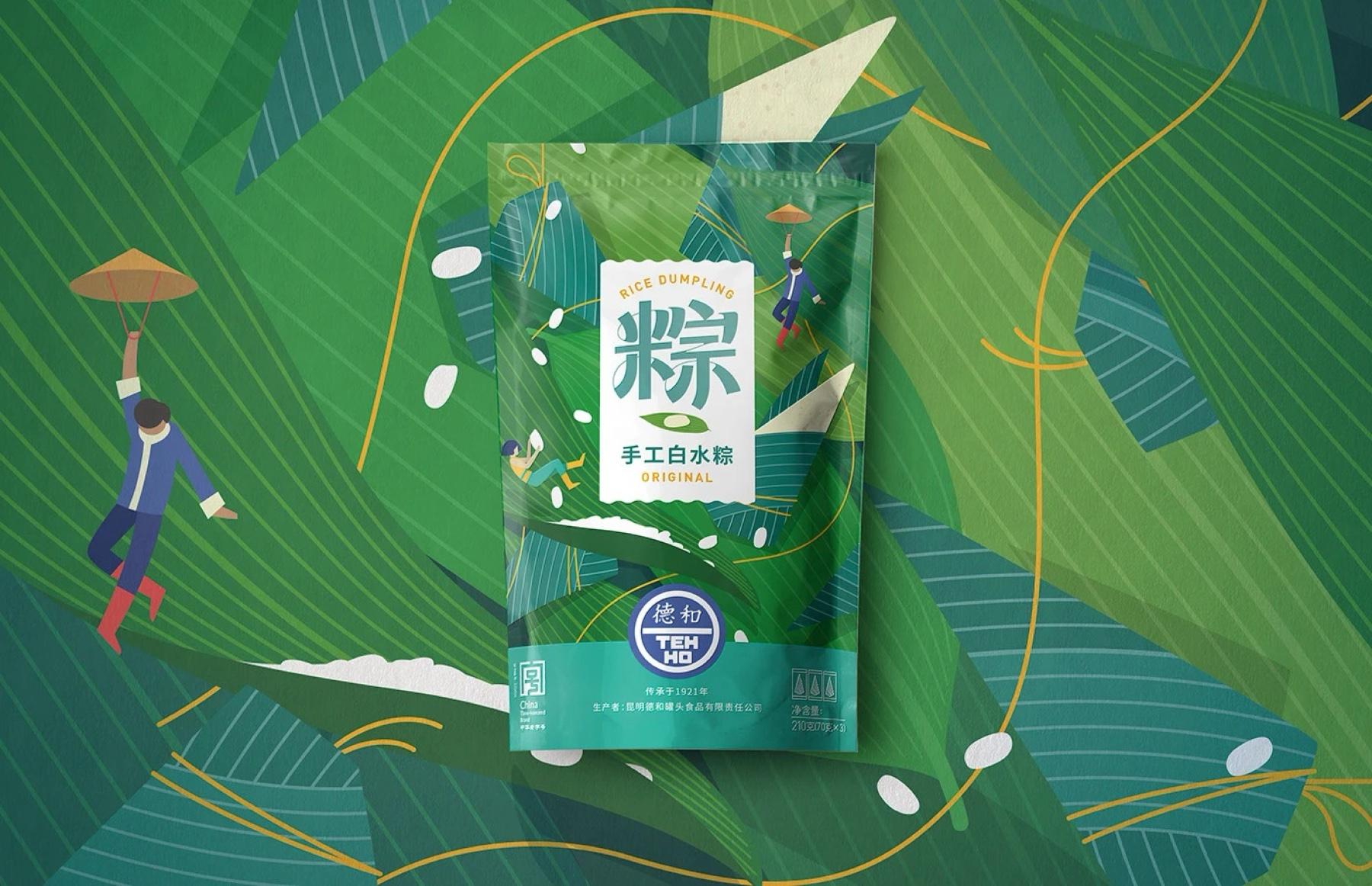
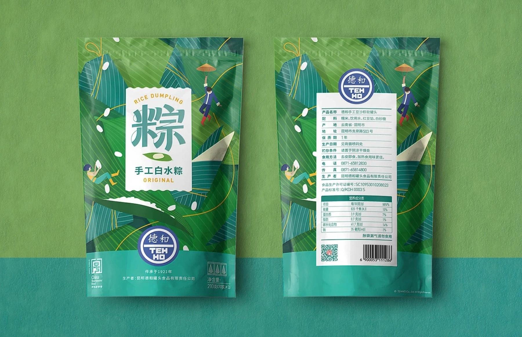
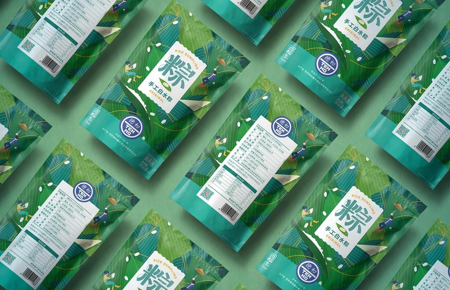
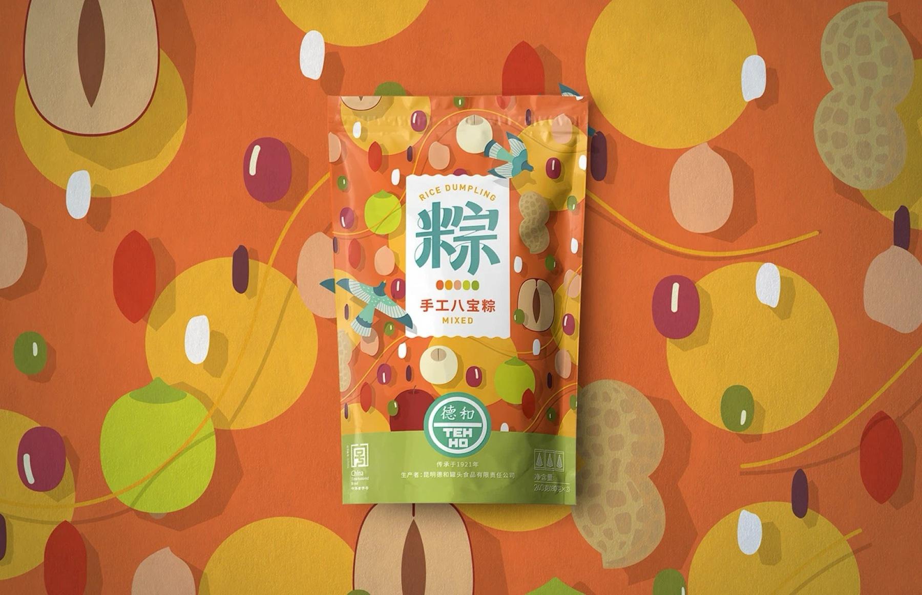
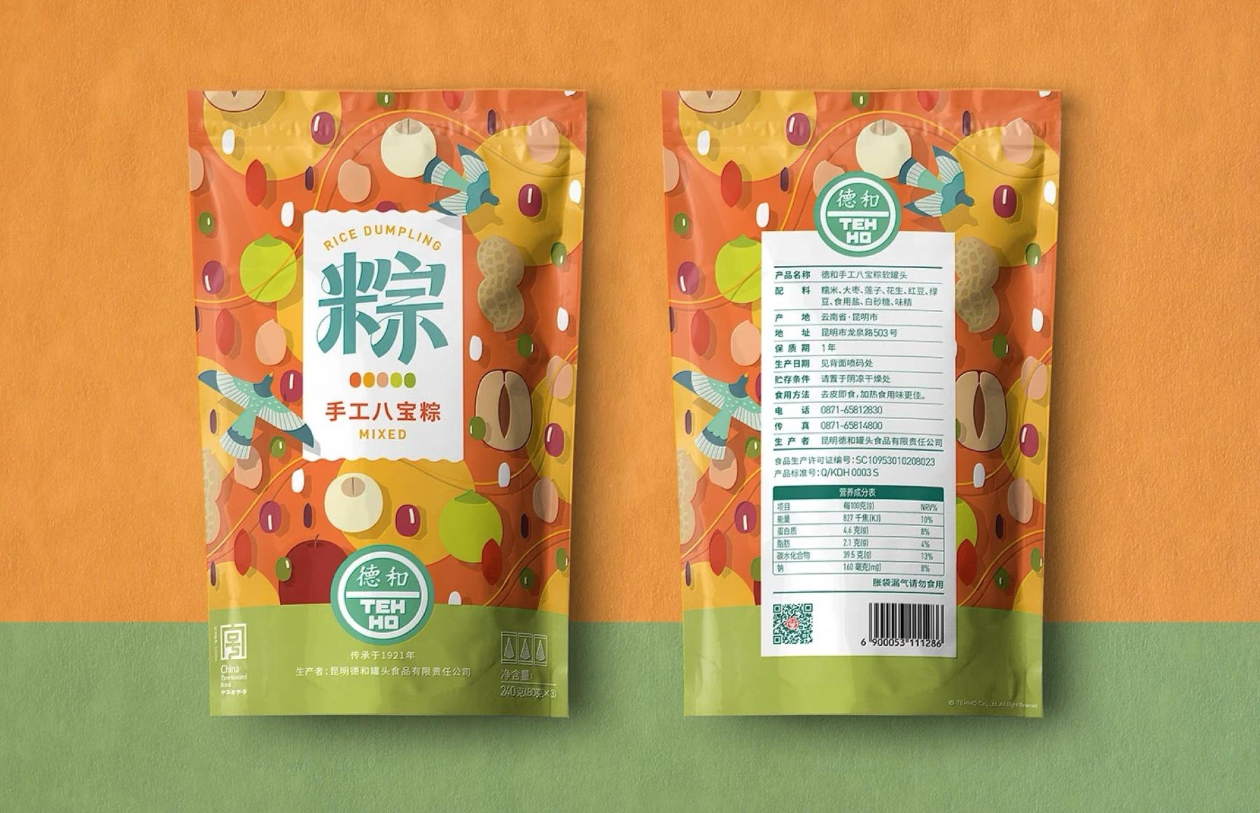
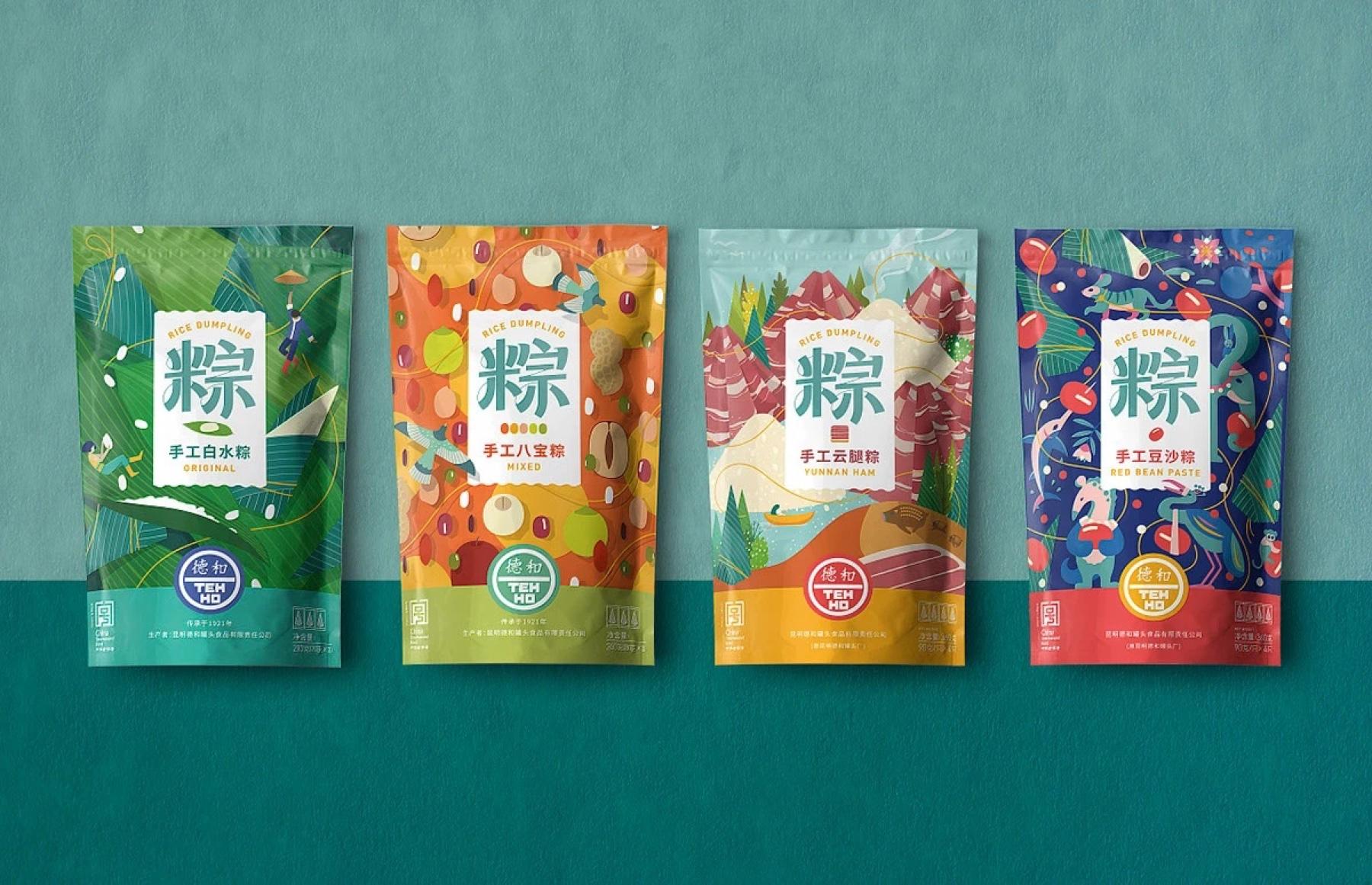
Festival zongzi packaging for DEHE: ingredient-based illustration and a distinct color world per flavor, built to be recognized on the shelf.
ScopeBrand identity / Packaging
OutputTypography / Illustration / Pouch packaging / Shelf display
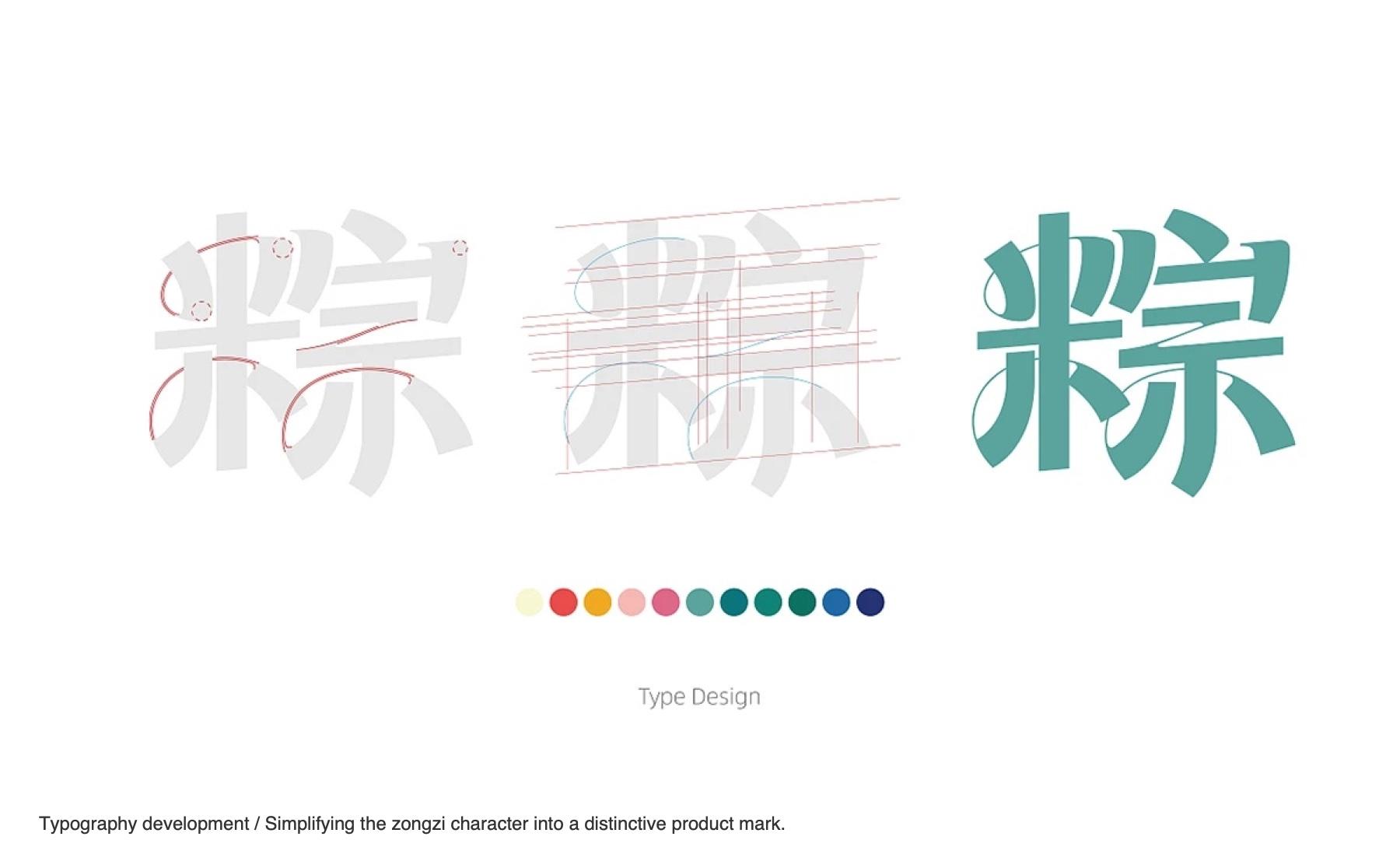
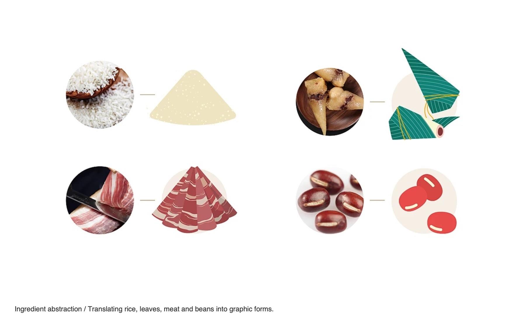
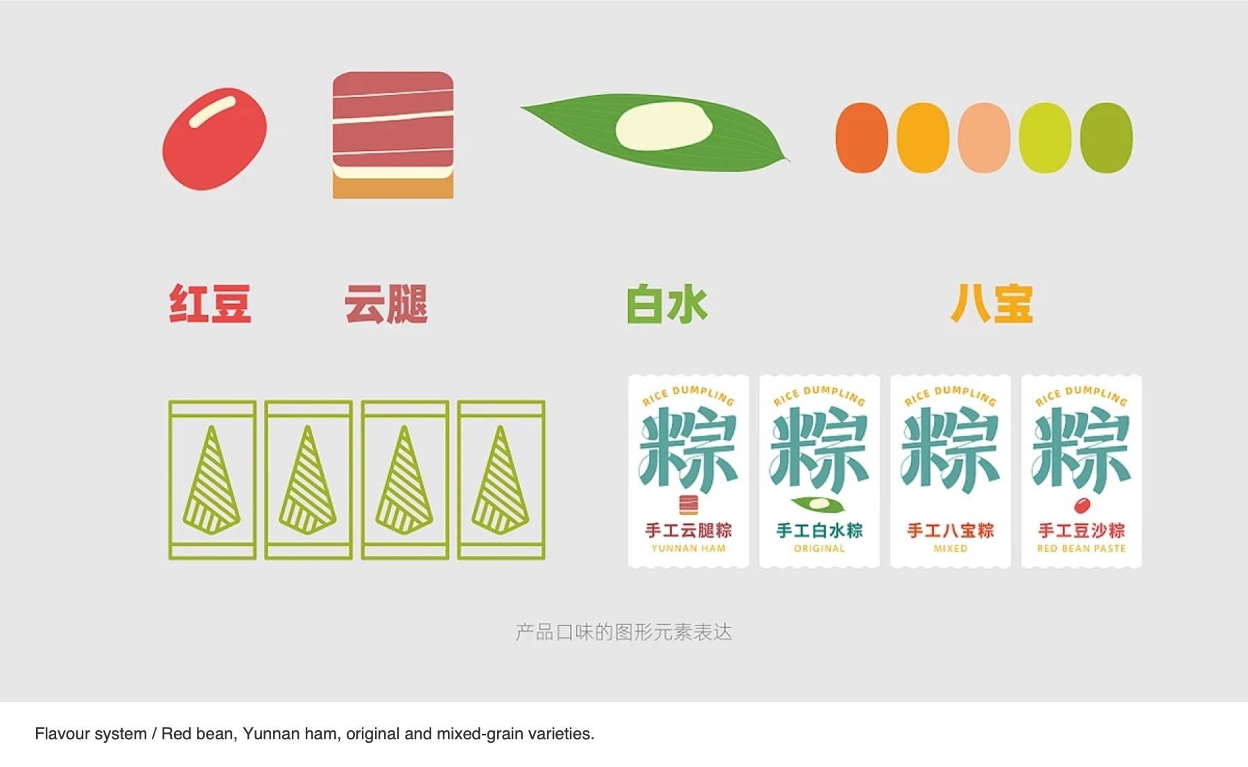
We simplified the zongzi character into a distinctive product mark, translated rice, leaves, ham and beans into graphic forms, and gave red bean, Yunnan ham, original and mixed-grain flavors each their own color world, with a clear reading order from product type to pack quantity.
The final system gives DEHE a bold, ingredient-led range that reads quickly on the shelf and joins adjacent packs into one display.