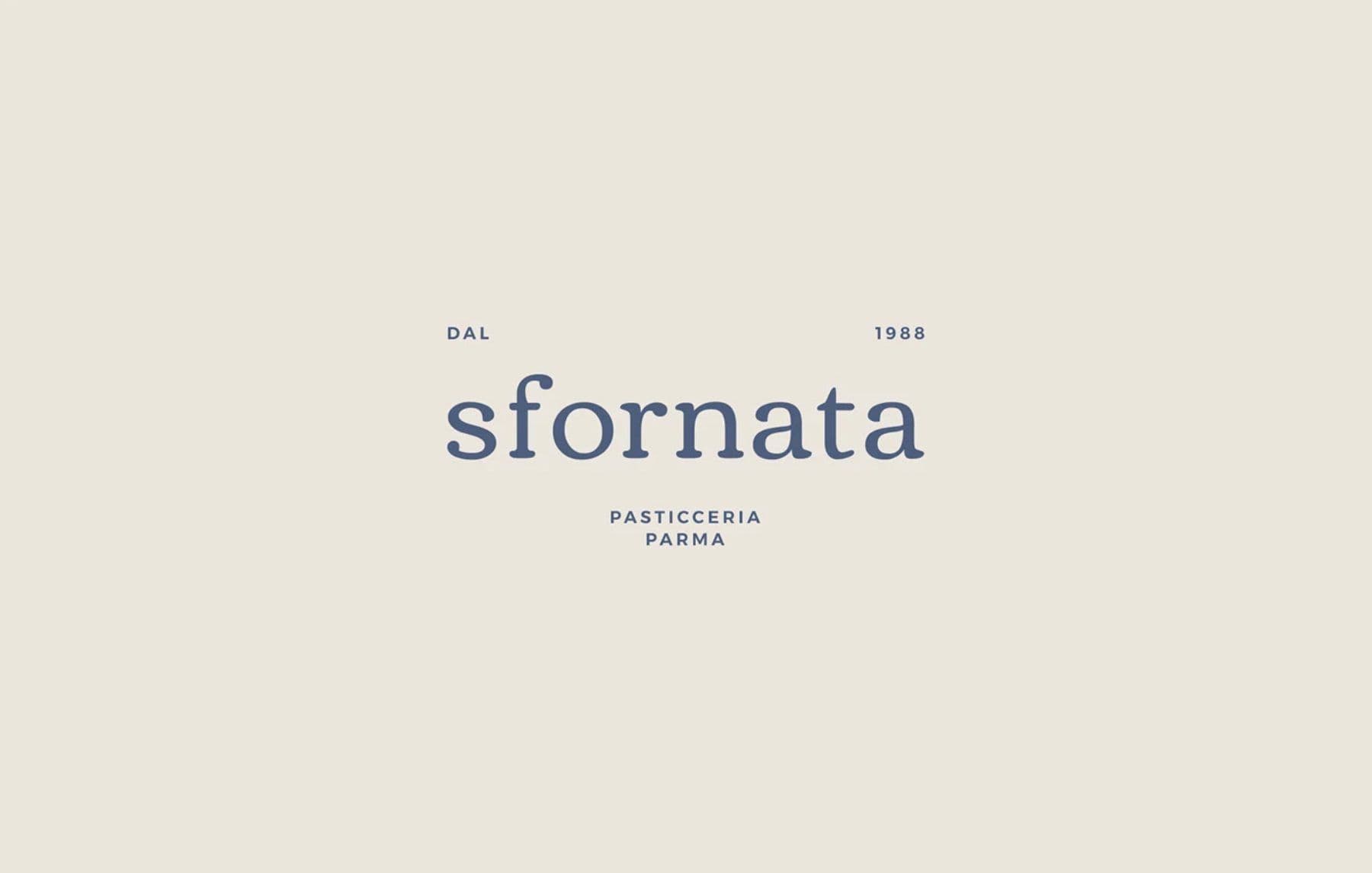
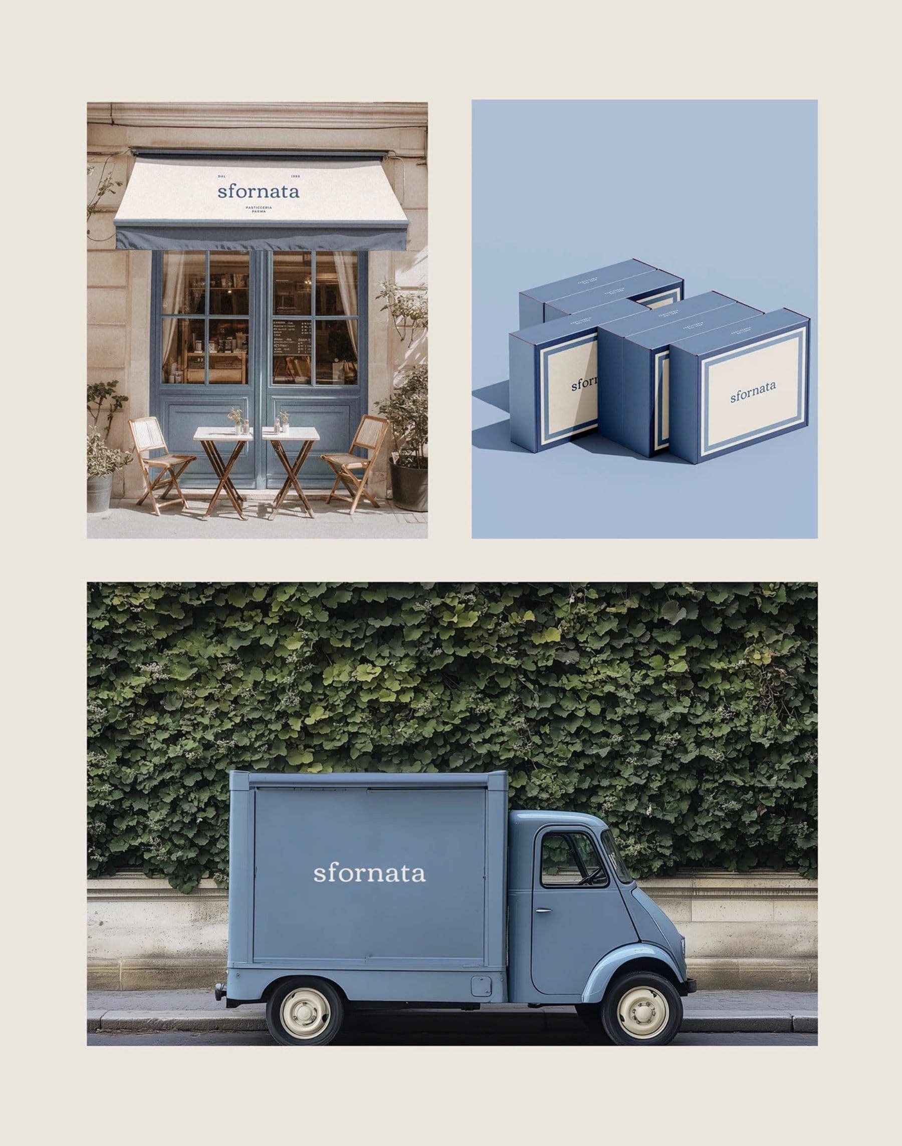
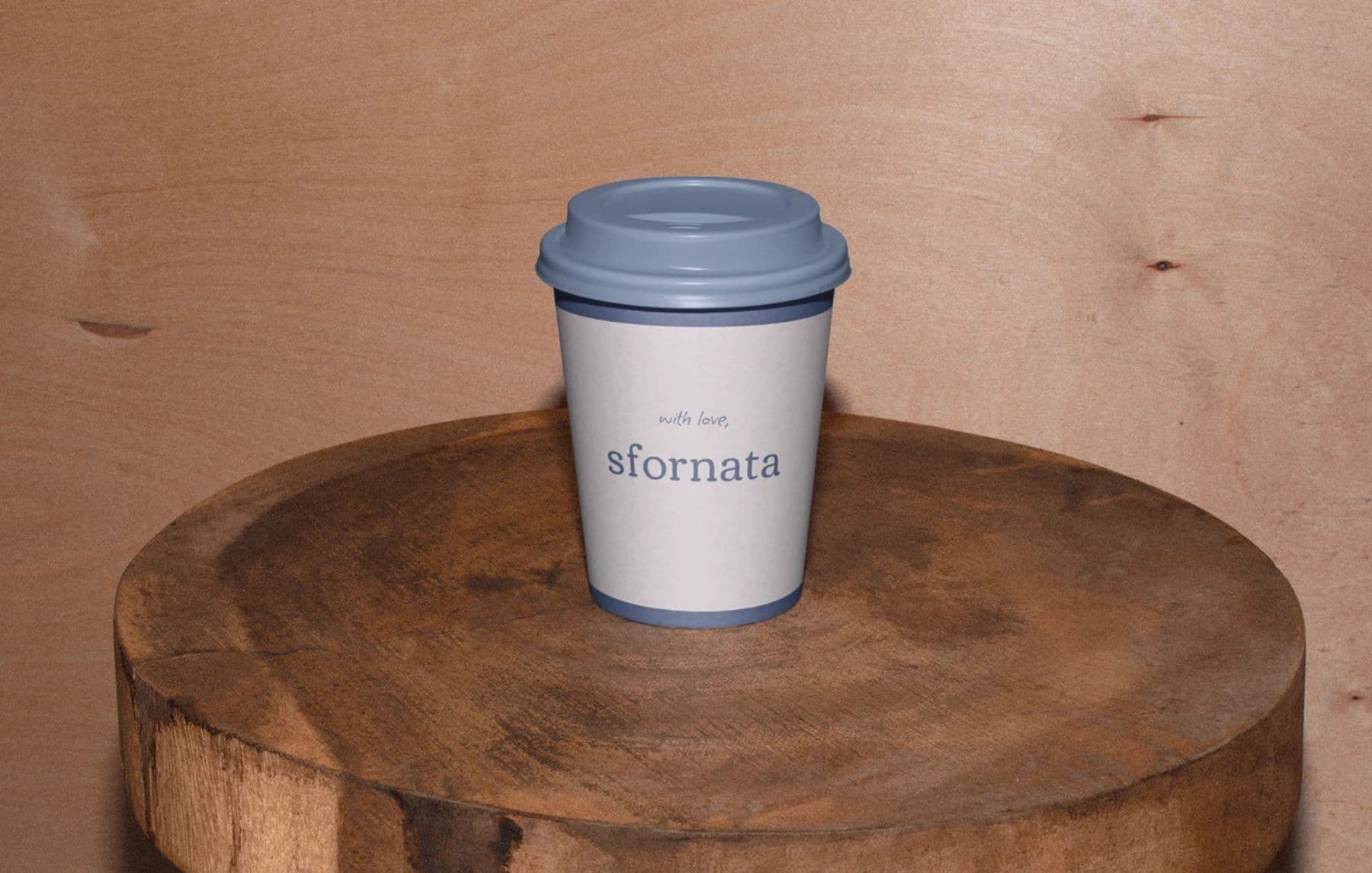
Sfornata needed a bakery brand that felt artisanal, warm, and appetizing.
BRAND IDENTITY · BAKERY BRAND
Sfornata
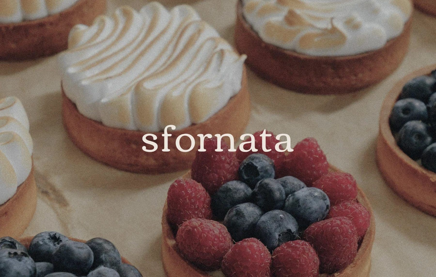
A soft, appetizing bakery identity that lets pastry photography and a gentle serif wordmark do the talking.
ScopeBrand identity
OutputWordmark / Photography direction / Brand applications
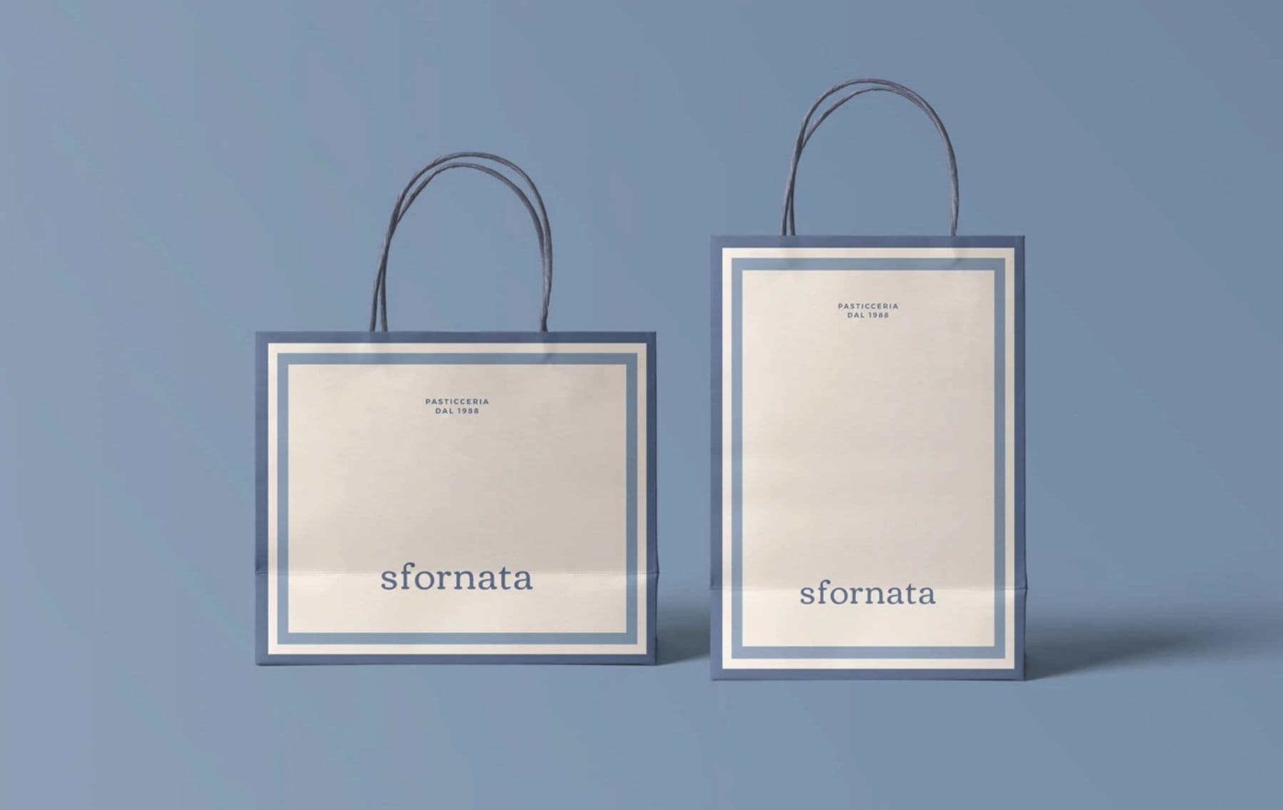
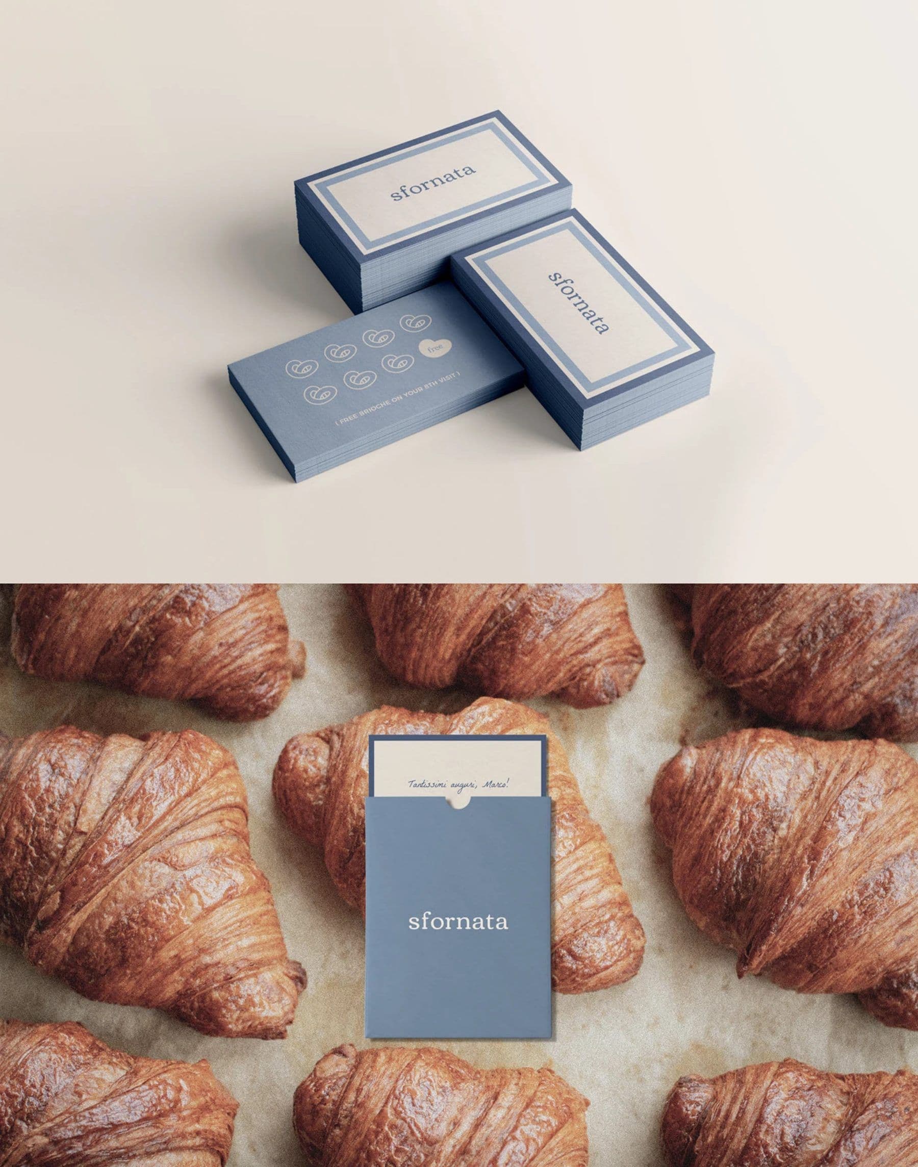
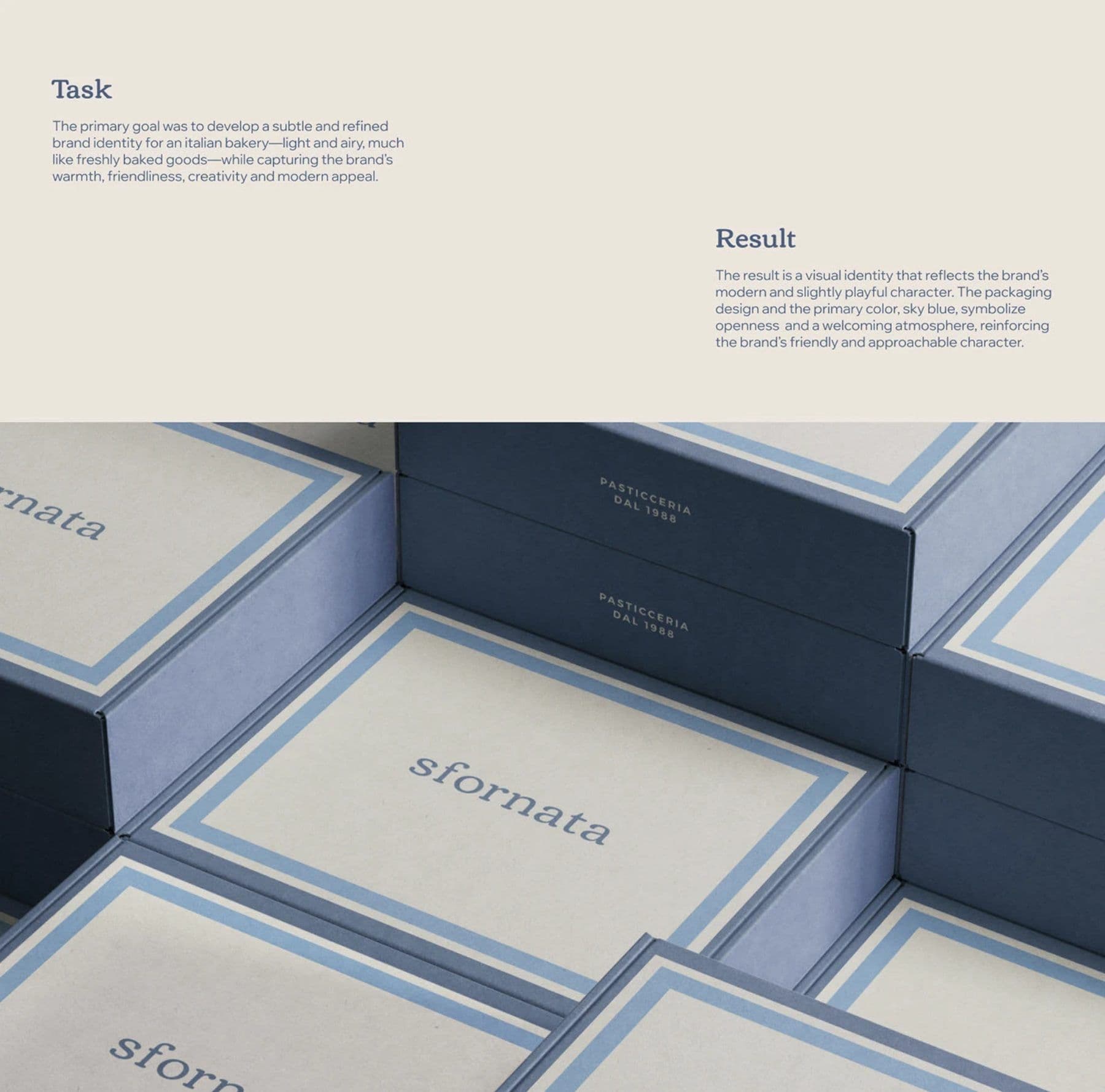
We created a gentle serif wordmark, a pastry-led photography direction, and brand applications that keep the bakery feeling handmade and inviting.
The final design gives Sfornata a appetizing bakery identity that is ready to apply across packaging, social, and future launches.